How to design more actionable edtech dashboards: part 1—eleven principles

Educators don’t want more data—they want better insights
One of the potential benefits of edtech is the stream of detailed insights that it can generate for learners, teachers, parents, and education stakeholders. But rich data does not mean rich insights. In fact, the richer the data, the harder you have to work in edtech design to make it really useful for your users.
Data visualization is a highly creative discipline that’s part science, part art. As a developer, it’s easy to be mesmerized by novel presentations, snappy features, and data detail, and lose track of what your user is trying to achieve (aka outcomes). Equally, compiling reliable measures of performance (formative and summative) requires a solid grasp of assessment (and its limitations). And, on top of all this, there are valuable lessons from Learning Science research on the most impactful ways to motivate, intervene, and help students to grow.
So, this is an area where leaders in edtech can innovate, stand out competitively, and deliver significant value—by providing educators with more understandable, more valuable, more actionable insights.
Design insights around a user’s “insights journey”
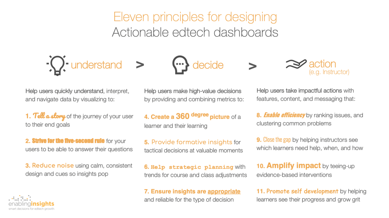
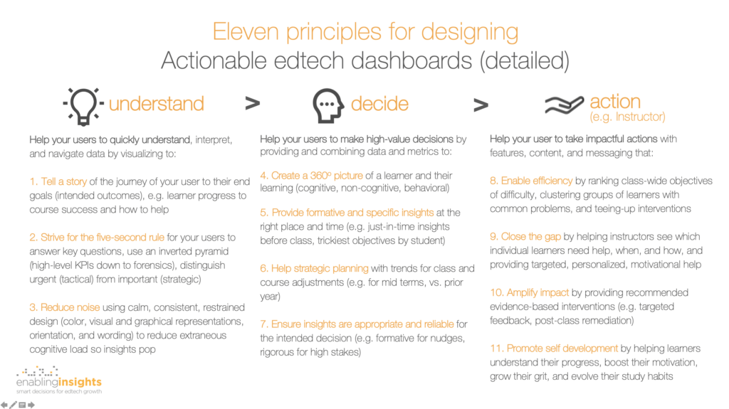
From 20 years of working with teachers and instructors, developing edtech solutions, leading UX and learning science teams, and being a little obsessive about good design, I’ve found it useful to think about a simple user journey for insights: understand, decide, and action.
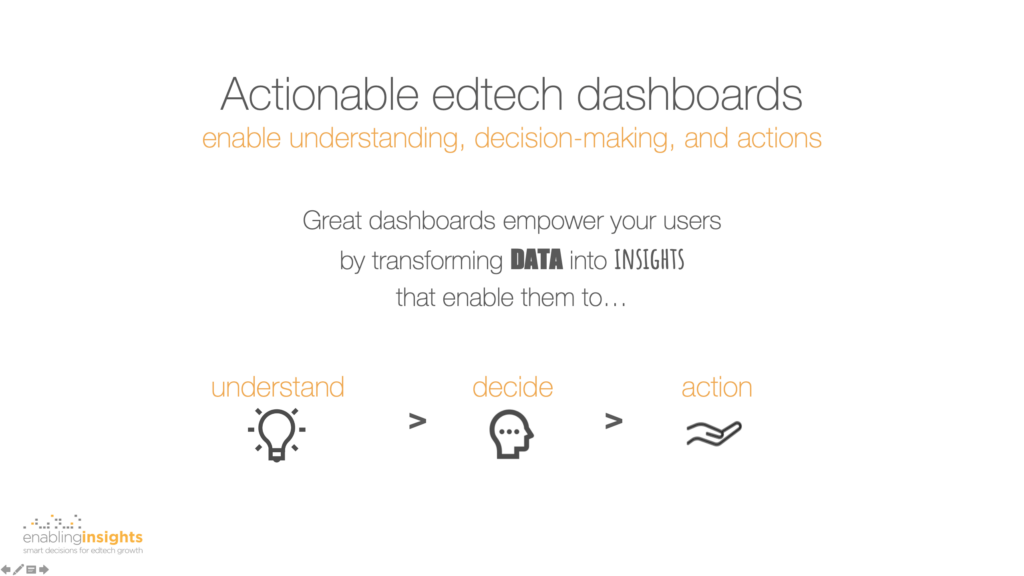
Following this journey, ask yourself this: how can I design insights to empower my user through each phase? Let’s take the example of an instructor. How can you transform data into insights that are presented to help your instructor to:
- Understand, interpret, and navigate data—using careful, consistent, and self-explanatory design.
- Make high-value decisions—by providing and combining metrics to create a complete picture of their learners, and valuable formative and strategic, micro and macro insights.
- Take impactful actions—with features, content, and messaging that bring them closer to their learners, and enhance their teaching efficiency and impact.
Eleven guiding principles
Following this insights journey—understand-decide-action—I’ve evolved eleven principles for coaching product teams on designing more actionable edtech dashboards. None of these are new, but the synthesis and practical organization may be.
Other great resources
There are many great resources to inspire you on dashboard design! Below are some of my favorites in several distinct categories:
Data visualization
- Beautiful evidence, by Edward R. Tufte—Tufte remains (for me) The Godfather of information design and his principles remain timeless in print and digital.
- Data is beautiful, by David McCandless—Candless is a non-stop source of inspiration to me on contemporary and creative visualizations.
- What Data Visualisation Experts Wish They Knew When They First Started, by Evelina Judeikytė—visualization designer Judeikyte provides a fantastic anthology of lessons learned from leading designers.
edtech dashboards
- Guide To Actionable Student Data Part 2—How Could EdTech Companies Provide Actionable Insights For Teachers, by Diana (Fangyuan) Yin—Yin provides some rock-solid basic principles for how to make data more usable to educators.
- Making Better Data Dashboards, by Charlotte Duncan et al.—Duncan’s White Paper provides a great summary of current problems, establishes common vocabulary, and provides a very useful framework (page 5).
- Designing Systemic Learning Analytics at the Open University, by Professors Belinda Tynon and Simon Buckingham Shum—review both the institutional and edtech requirements for effectively using data to drive student success.
Learning design
- Multimedia learning principles, by Prof. Rich Mayer—Mayer has been a source of inspiration to me for 20 years and his principles for multimedia design are acutely relevant for dashboard design.
- Learning Science Foundations on analytics, by Dr. Jeff Bergin et al.—my former fabulous Learning Science team at Macmillan Learning provide a fantastic synthesis of learning science research and transform these into a set of evidence-based principles.
- Data Visualization, by the Learning Science team—Pearson provides a set of rigorous and academic evidence-based principles, and some tools to help you self assess your approach.
Need help?
Here’s a downloadable PDF. In a forthcoming blog, I’ll share some wireframes to illustrate each of these eleven principles for designing more actionable edtech dashboards [Update 20 August, 2020: Part 2 – design examples.]
If you want a fast and incisive assessment of your current dashboards and practical tips for how to design them to more actionable and competitive, we’d love to help. Please contact us today with the form provided below.